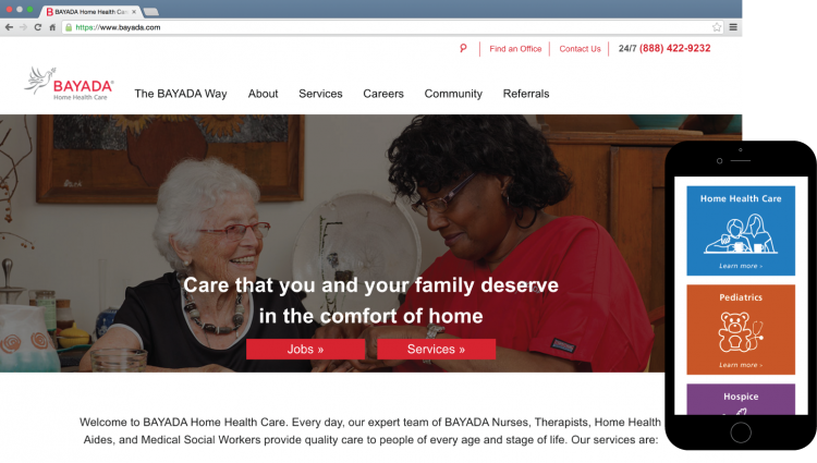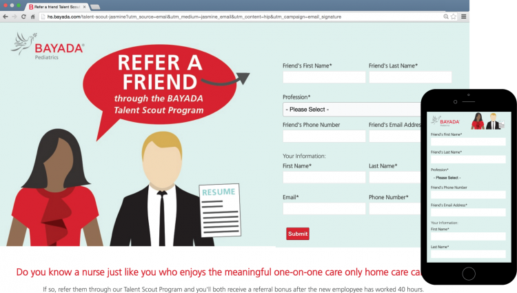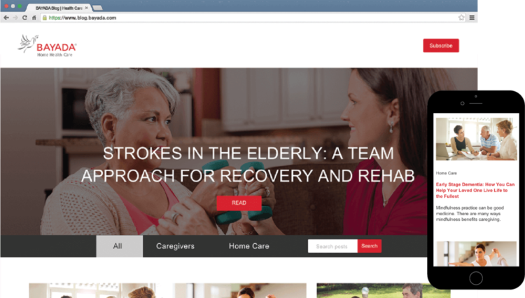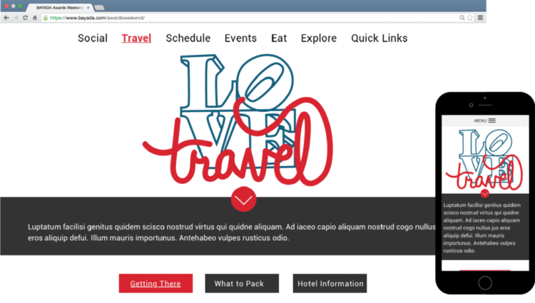
After observing users’ behavior using Mouseflow, it was clear that users needed some help with navigating the site. The index page previously utilized icons below the hero banner to highlight important pages on the site. Analytics showed that these icons weren’t being heavily utilized.
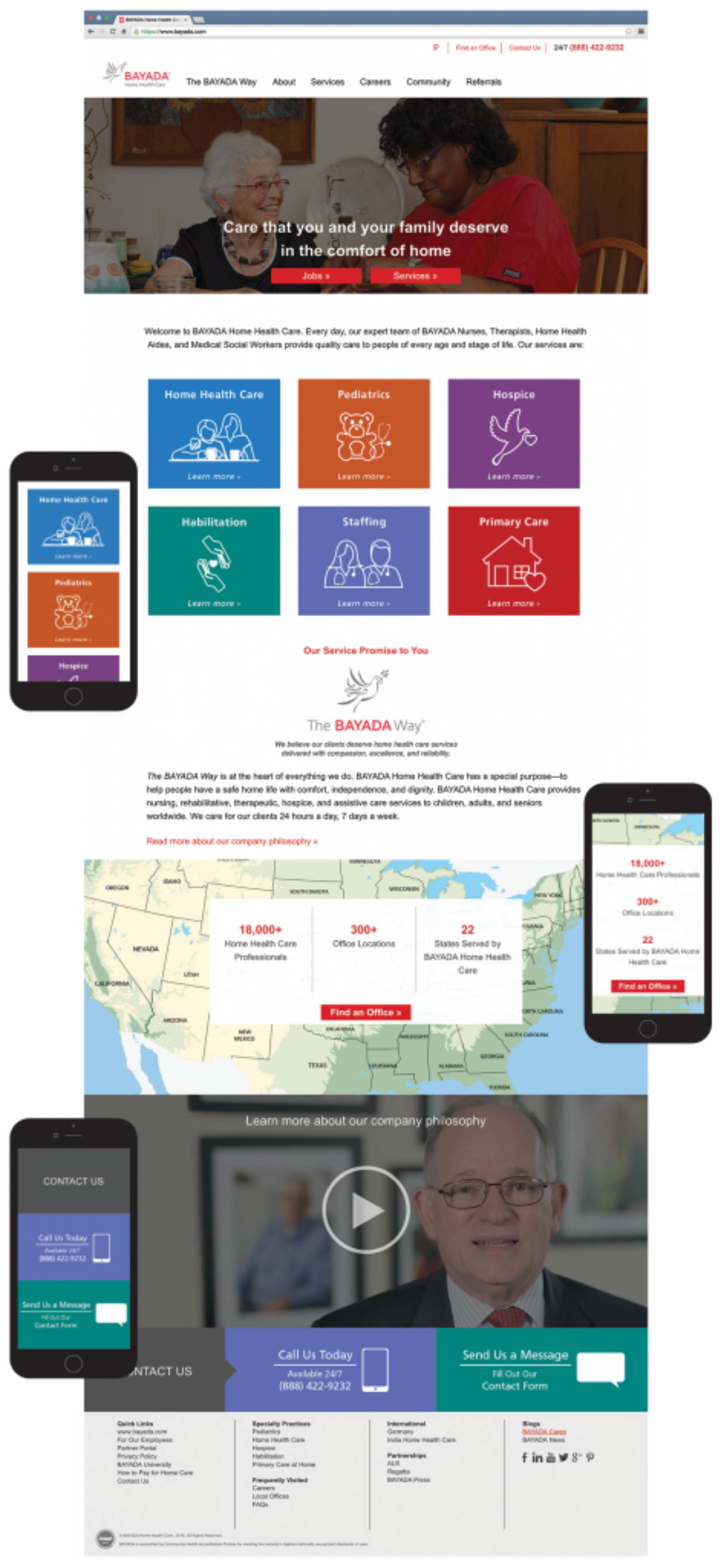
Our first action was to provide visitors’ with two prominent CTAs within the hero banner to help them more efficiently find what they’re looking for. These CTAs were created to attract two main types of users – prospective employees and prospective clients.
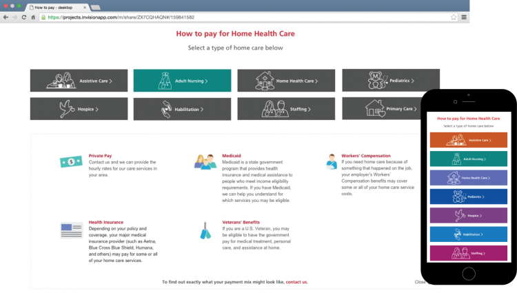
Our next step was to incorporate more information about BAYADA’s service offerings to help prospective clients better understand what service type they may need. Each service was given a unique color and custom icon to help differentiate from each other.
BAYADA considers it’s company philosophy an essential foundation of the brand. We decided to include the philosophy “The BAYADA Way” on the page to quickly inform users about BAYADA’s beliefs and values.
An important tool on the site is our “Find an Office” tool – helping prospects find their local office while being able to filter through services. We utilized a stylized map on our page – highlighting quick facts about the company including the total amount of employees, offices, and states.
Lastly, we included bold CTAs at the bottom of the page to prompt visitors to contact us.
The redesign of bayada.com resulted in better user engagement on the index page and increased visits to our jobs site, Home Health Care microsite, The BAYADA Way page, and Services page.
© Kat Findley 2018

